


Presentation Designs Made Simple for Beginners in Seven Ways
Students, researchers, educators, or businessmen, everyone needs a good presentation to convey their message with a lasting impact. Yes, of course, it can be said verbally or shown in writing without the pitch deck, too. But have you seen the scientific evidence of how much more effective visual presentations are?
Studies show that graphics, charts, and storytelling help people retain up to 80% more information compared to text or speech alone. Hence, if you want the audience to think again about you long after the discussion is over, you need to act smarter. Continue reading the blog to learn how to turn your boring slides into more than just a decoration.
The Beginner’s Guide to Outstanding Presentations

The only formal communication that sticks longer is the one delivered through a well-planned presentation design. It is true and also supported by scientific evidence. When people see something, they don’t just understand it faster; they also remember it longer.
Hence, you need graphics to share a piece of information with your audience. It grabs attention and makes sure your messages not only land as intended but also stay with the audience. Let us now continue with the 7 brilliant beginner-friendly tips for making slides.
1. One Concept per Slide
The biggest mistake many presenters make is that they shove multiple ideas into a single slide. What they don’t realise is that it only confuses their audience. Hence, make sure to stick to one concept per slide, so that your message stays focused and easy to follow.
This approach also guides your audience through your presentation step by step, without overwhelming them. In addition, it gives each idea the space it deserves, making your content more digestible.
|
Remember: Simplicity always wins when it comes to clarity. |
2. Choose High Contrast but Limited Colours
The high contrast colours always ensure that your text and visuals are easy to read. So, it is advised that you use dark text on a light background and vice versa throughout the pitch deck. However, you must not go overboard.
Stay consistent with just two or three complementary colours as they will keep your slides clean and professional. We do not recommend too many shades at all. They can feel chaotic and distract the audience from your message.
|
Use colours intentionally to guide attention and reinforce meaning. |
3. Keep Your Visual Hierarchy Strong
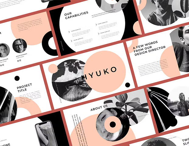
Visuals that are used in a presentation can be anything ranging from charts, graphs, icons, or even a business logo design. But you cannot just scatter them anywhere. They have to fall in place one by one nicely according to the hierarchy so that it can easily guide the viewer’s eye to what matters the most.
This can also be done by cleverly making use of different font sizes, boldness, and placements. Apart from this, remember that titles should stand out, subheadings should support, and body text should be easy to scan.
4. Use Graphics Strategically
The graphics are one of the most supportive elements of the presentation. They should be chosen carefully to complement your message and not just used as space fillers. Hence, go for simple ideas that don’t take more than 15 seconds to comprehend.
Additionally, the high quality of the images and relevance are crucial. The blurry or generic ones can hurt the credibility of your message. On the same note, remember to strategically place them and not overload the deck with visuals.
|
Strategic use of graphics helps your audience stay engaged. |
5. Don’t Use Clipart
Clipart has been a reliable source of visuals for years, but now we all must accept that it is outdated. It can make your presentation feel less reliable, especially in academic or business settings. So, instead of it, you need to start using modern icons, vector illustrations, or high-resolution images that match the tone of your topic. You can now use the stock images.
6. Add Lines to Breakup Data
When presenting tables, charts, or dense information, a few lines here and there can help organize the content. It can also guide the reader’s eye. Thus, go for horizontal or vertical dividers to separate sections and highlight key figures.
This will make your data easier to scan. Moreover, you need to keep it clean and avoid the heavy borders. This is important because too many lines can clutter the slide.
|
It’s a small design twist that makes a big difference. |
7. Turn It Into a Game
The last tip for everyone is to try to turn your pitch deck into a relevant game. Yes, a game like that will be your interactive element. You can use quizzes, polls, or even quick challenges to make your presentations more engaging.
Such elements encourage participation and keep your audience alert. Gamifying your content also helps reinforce learning and makes your message stick. Hence, make sure the game fits your topic and audience.
FAQs
ð How many slides should a good pitch deck have?
A good presentation is usually supposed to have around 10–15 slides, but this truly depends on your topic. So, as far as you are focusing on clarity, not quantity, any number of sliders is correct. However, make sure that each slide supports only one key idea. It helps keep your audience engaged without overwhelming them with too much information at once.
ð Should I use bullet points or visuals more?
Honestly, using visuals more than bullet points is a better idea. For example, you can add images, charts, and icons. All of these will help people understand and remember your message better. On the other hand, bullet points are fine for structure, but too many can feel like reading a document instead of watching a presentation.
ð What font size is best for presentation slides?
You must keep your titles at least 36pt and body text no smaller than 24pt. This ensures readability even from the back of a room. Also, you must avoid fancy fonts. Just simple, clean, and professional fonts like Arial, Calibri, and Helvetica.
ð Can I use templates, or should I design from scratch?
Templates are great for beginners. They save time and give your slides a clean, consistent look. However, if you use them, just make sure to customize them enough so your presentation feels personal and fits your topic’s tone and audience.
The Summary
A good and well-planned presentation doesn’t need fancy animations or overloaded slides. As the experts suggest, it only needs clarity and a few features that hold onto the grabbed attention. So, you must aim for clean design, readable fonts, and visuals that support your message. These are all the things that will make a difference.
Also, people remember what they see more than what they hear, so remember! Your slides should guide, not confuse. Use the above-mentioned seven effective tips no matter what your purpose is for delivering a presentation.
Категории
Больше
When it comes to summer, beach trips, or poolside lounging, having a swimsuit that fits perfectly and reflects your personal style is a total game-changer. WaveZoneSwim has taken this idea to the next level by offering custom swimsuits designed for comfort, style, and individuality. Unlike off-the-rack options, custom swimsuits allow you to express yourself while feeling confident and...

Neue Set-Vorstellung Das kommende Set B1a „Feuerrote Flammen“ bringt eine aufregende Erweiterung für das Pokémon-Sammelkartenspiel Pocket mit sich. Besonders im Mittelpunkt stehen die mächtigen Mega-Pokémon-EX, die in der neuen Edition ihre beeindruckende Rückkehr feiern. Am 17. Dezember 2025 wird das Boosterpack veröffentlicht und bietet Spielern...
Polaris Market Research has announced the latest report, namely Fruit and Vegetable Processing Market Share, Size, Trends, Industry Analysis Report By Product (Fresh, Fresh-cut, Canned, Frozen, Dried & Dehydrated, Convenience); By Equipment; By Mode of Operation; By Region; Segment Forecast, 2025 - 2034, that examines the overall market condition both now and in the future. It provides...
Coffee is more than just a beverage—it is a daily ritual, a source of energy, and a moment of comfort. In the UAE, the culture of premium coffee has grown rapidly, driving demand for top-quality beans, fresh-roasted coffee, and authentic flavors. This is precisely where Cataliacoffee steps in as a trusted name offering exceptional products to coffee lovers. Whether you're an...

Executive Summary Asia-Pacific Video Measuring System Market Data Bridge Market Research analyses that the video measuring system market will exhibit a CAGR of 8.6% for the forecast period of 2022-2029. The Asia-Pacific Video Measuring System Market report has been designed in such a way that it proves to be the most appropriate to the business needs. Moreover, this market...