


3 Dashboard Mistakes That Are Instantly Killing Your Business Analytics Live Case Study Interviews

You have successfully cleared the initial resume screening, the HR interview, and the live SQL coding round for a Business Analyst role. You are now in the final stage—the live case study round.
A hiring manager at a top Global Capability Center (GCC) in Gurgaon’s DLF Cyber City or a fast-growing FinTech unicorn along Bengaluru’s Outer Ring Road hands you an uncleaned dataset and gives you 48 hours to build a dashboard and present your findings.
You spend late nights tweaking visuals, choosing bright color palettes, adding dozens of charts, and fine-tuning every tile. On interview day, you share your screen with confidence.
Yet, a week later, a generic rejection email drops in your inbox: "While your profile is impressive, we have decided to move forward with another candidate."
What went wrong?
In the corporate hiring ecosystem, analytics directors do not reject candidates because they lack basic software skills. They reject them because their dashboards reveal amateur design habits, weak underlying data models, and a complete lack of commercial business logic.
If you want to clear live case study rounds with flying colors, here are the 3 critical dashboard mistakes that are killing your interviews—and how to fix them immediately.
1. Visual Chaos & Cognitive Overload (The "Rainbow Palette" Trap)
The most common mistake freshers and junior analysts make is treating a business dashboard like an art project. They attempt to show off every chart type available in Power BI or Tableau—cramming pie charts, 3D column graphs, radial gauges, and scatter plots onto a single crowded canvas.
┌─────────────────────────────────────────────────────────────┐
│                 AMATEUR vs. EXECUTIVE LAYOUT                │
├──────────────────────────────┬──────────────────────────────┤
│ Amateur Visual Chaos         │ Executive Grid Layout        │
│ - 12 different visual colors │ - Clean 2-to-3 color palette │
│ - 15 crammed, tiny charts    │ - Top KPI Summary Cards      │
│ - 3D charts & 10-slice pies  │ - F-Pattern reading grid     │
│ - High visual noise          │ - High Data-Ink Ratio        │
└──────────────────────────────┴──────────────────────────────┘
When an interviewer looks at a cluttered screen with 15 neon-colored visual elements, their brain experiences immediate cognitive overload.
Why This Fails in Interviews:
Senior leaders do not have time to hunt for information. They want to understand corporate performance within five seconds of looking at a screen.
To evaluate whether a dashboard is clean, analytics leads apply the Data-Ink Ratio principle:
If your screen is filled with heavy gridlines, dark background tiles, redundant chart legends, and decorative graphics, your Data-Ink ratio is extremely low.
How to Fix It:
-
Follow the F-Pattern / Z-Pattern Reading Grid: Place high-level executive KPI summary cards across the top row (e.g., Total Revenue, Gross Margin %, Churn Rate). Place main trend charts in the center, and detailed breakdown tables at the bottom.
-
Limit Your Color Palette: Use a clean, neutral background (light gray or white) with a single dominant accent color (like navy blue) to highlight key data anomalies.
-
Ditch Multi-Slice Pie Charts: Never use pie charts with more than 3 slices. Replace them with horizontal bar charts sorted in descending order.
2. Pretty Visuals Built on Broken Data Architecture (The "Flat Table" Nightmare)
An even bigger red flag occurs before you even create a single chart: how you structure your data behind the scenes.
Unskilled candidates often take an uncleaned, 500,000-row Excel spreadsheet and dump it directly into Power BI as a single, massive flat table. They build visuals without establishing a proper relational Star-Schema data model.
  [ Flat Table Approach (Broken) ]  ──► Single CSV ──► Slow Performance & Calculation Errors

  [ Star-Schema Architecture (Pro) ] ──► Fact Table + Linked Dimension Tables ──► Fast & Scalable
Why This Fails in Interviews:
During live presentation rounds, interviewers will purposely ask you to filter data across multiple slicers simultaneously (e.g., "Filter sales by North Region, Enterprise Segment, and Q3 Fiscal Year").
If your dashboard is built on a messy flat table:
-
Visual calculations will freeze or lag visibly on screen.
-
Complex DAX measures will return inaccurate totals or blank visual cards.
-
When the interviewer opens your " Model View " tab, they will see zero table relationships—instantly revealing that you lack fundamental database knowledge.
How to Fix It:
Always clean your raw data in Power Query (ETL) before building visuals. Separate your dataset into a central Fact Table (containing transactional numbers and metrics) connected to surrounding Dimension Tables (containing attributes like Customers, Products, Regions, and Calendars) using proper $1:\infty$ primary and foreign key relationships.
3. Delivering "Chart Reading" Instead of Business Insights (Zero "So What?")
The most fatal mistake candidates make happens when they open their mouth to speak.
When the interviewer says "Walk me through your dashboard," amateur candidates spend five minutes pointing at visuals and reading numbers out loud off the screen:
"As you can see, this bar chart shows sales in Gurgaon were ₹1.2 Crores, while Noida was ₹80 Lakhs, and the line chart shows revenue went up in May..."
The interviewer can already read the numbers. What they are testing is your ability to answer the ultimate corporate question: "So What?"
Data Metrics ("What") ──► Operational Cause ("Why") ──► Strategic Action ("So What?")
If your dashboard displays a 10% drop in regional sales, but you cannot explain why it dropped or what strategic action management should take, your dashboard is functionally useless to executive leadership.
For instance, if you are analyzing unit margin compression in an e-commerce case study, you must connect data visuals directly to commercial financial logic:
How to Fix It:
Structure your presentation around operational root causes:
-
Don't just say: "Delivery margins dropped by 4% in Tier-2 hubs."
-
Do say: "Our SQL analysis reveals that a 15% delay in regional transit processing drove up rider penalty costs, which eroded net profit margins by 4% in Tier-2 distribution hubs. We recommend reallocating order fulfillment to adjoining hubs to recover ₹12 Lakhs in quarterly cash flow."
Amateur vs. Executive Dashboard Comparison
| Dashboard Dimension | Amateur Candidate (Rejected) | Executive-Ready Candidate (Hired) |
| Visual Design | 15+ crammed charts, neon colors, 3D graphs | Clean grid layout, 2-3 colors, high Data-Ink ratio |
| Data Architecture | Single messy flat CSV table | Clean Star-Schema model built via Power Query |
| DAX & Calculations | Hardcoded numbers or broken aggregations | Dynamic DAX measures calculating YoY trends |
| Presentation Style | Reads chart numbers out loud | Identifies root causes & delivers strategic actions |
Master Interview Case Studies with SLA Consultants India
To avoid these critical dashboard traps and clear tough live case study rounds at top MNCs, GCCs, and consultancies, self-learning through scattered online video playlists is rarely enough. Candidates need hands-on practice with dirty enterprise datasets, code-debugging guidance, and direct mentorship from industry veterans.
This is where SLA Consultants India serves as an essential training launchpad for freshers, non-tech graduates, and job seekers across Delhi NCR (Delhi, Gurgaon, Noida) and corporate India.
SLA Consultants India has built a strong reputation as a premier practical skilling institute, specializing in preparing candidates for live corporate selection rounds:
-
100% Written Placement Support Guarantee: SLA Consultants backs its training programs with a formal written agreement for placement assistance. Once you complete 70% of your course, their active placement cell connects you directly with corporate hiring channels across top IT MNCs, GCCs, and consultancies.
-
Mentorship from Senior Corporate Leaders: Learn directly from Senior Business Analysts with 10+ years of active corporate experience who train you on real-world client delivery workflows, business problem-solving logic, and live dashboard presentation techniques.
-
Comprehensive, AI-Integrated Tool Stack: Master the complete low-code analytics stack expected by enterprise employers—including Advanced Excel (Power Query, Power Pivot), VBA/Macros process automation, SQL database querying, MS Access, Power BI, Tableau, and modern ChatGPT AI integration for analytics.
-
Practical Workshops & Portfolio Assets: Hands-on lab work, technical test series, and live case study simulations ensure you build an interview-ready project portfolio before meeting hiring managers.
Enrolling in an industry-aligned, practical business analyst course gives you the technical depth, Star-Schema data modeling skills, and executive presentation confidence needed to crush your live case study interviews and land high-paying job offers.
Final Thoughts
A business dashboard is not a decorative graphic—it is an executive decision engine designed to solve commercial problems.
Eliminate visual clutter, build a solid Star-Schema data model behind the scenes, focus on operational root causes, and present actionable recommendations.
Master the low-code analytics stack, leverage expert mentorship from SLA Consultants India, build a standout portfolio, and step into your next Business Analyst interview loop with total confidence!
الأقسام
إقرأ المزيد
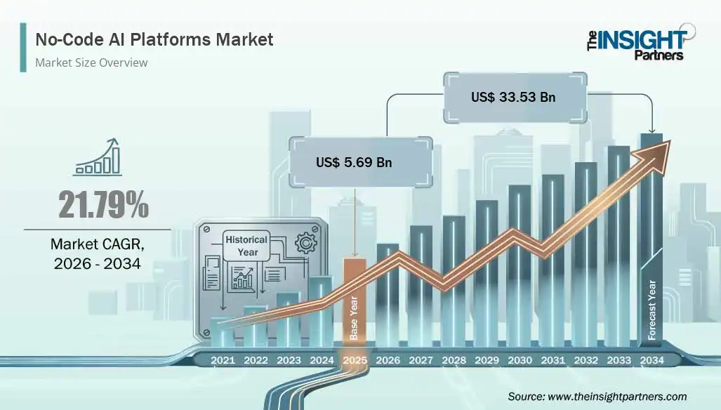
The No-Code AI Platforms is witnessing remarkable growth as organizations increasingly seek artificial intelligence solutions that eliminate the need for complex programming expertise. According to market estimates, The No-Code AI Platforms Market is expected to grow from US$ 5.69 billion in 2025 to US$ 33.53 billion by 2034, registering a CAGR of 21.79% during 2026-2034. This...
Season 2 of the acclaimed Netflix drama Ozark gains a formidable new presence with the addition of Janet McTeer. The Academy Award®-nominated actress will portray a Chicago attorney connected to the cartel. This character's dangerous alliance positions her as a significant new obstacle for the Byrde family. McTeer's casting follows a wave of award recognition for the series' first season....

Mental health plays a vital role in overall well-being, affecting how people think, feel, and manage daily challenges. A professional mental health service provides individuals with the support, guidance, and treatment needed to improve emotional stability and mental wellness. Whether someone is dealing with anxiety, depression, stress, trauma, or behavioral challenges, quality mental health...

Older homes often have character, durable construction, and architectural details that make them unique. However, many were built before modern energy-efficiency standards became common. Drafty windows, inadequate insulation, inefficient heating systems, poor ventilation, and outdated lighting can all increase energy consumption and make indoor temperatures harder to control. Fortunately,...

Natural fragrance refers to naturally derived aroma ingredients obtained from botanical and plant-based sources, offering an alternative to synthetic fragrances in cosmetic and personal care formulations. The Natural Fragrance Market size is expected to reach US$ 10.25 Billion by 2033 from US$ 4.78 Billion in 2025. The market is estimated to record a CAGR of 10.00% from 2026 to...