


Stop Treating Your Contact Page Like a Digital Filing Cabinet
Your contact page is the moment of truth. It's where a visitor crosses from "maybe" to "yes, let's talk." Yet most businesses handle this pivotal page with all the care of a junk drawer. They toss in a generic form, add an address, and call it organized.
That disorganization is expensive. Every form started but never finished is a customer who walked away frustrated. Every unclear field is a speed bump that sends prospects back to Google. When your contact page feels like paperwork, people will find an easier path—usually straight to your competitor.
I've rebuilt more contact pages than I can count in my work as a website designer. The same broken patterns show up everywhere: bloated forms, zero transparency, and mobile experiences that would make anyone cringe. Here's what should excite you—most of these problems have surprisingly simple fixes. You don't need to burn your whole site down and start over.
Let's walk through how to turn that neglected page into something that actually works.
Why Nobody Cares About the Contact Page
Creative teams fight over homepage layouts. They debate product page copy for weeks. They pour hours into blog strategy. The contact page? It's an afterthought, if it's a thought at all.
The assumption is that simple equals good enough. But "simple" and "effective" are two very different things. Your contact page has a three-part job: make it easy, make it trustworthy, and make it predictable. Drop the ball on any of those, and you're hemorrhaging leads you never even knew you had.
Think about who's actually landing here. These aren't random browsers. These are people who found you, liked what they saw, and decided to take the next step. They're handing you their attention on a silver platter. Your job is to not drop it.
The Five Form Killers
The Interrogation Approach
Nobody wants to fill out a census just to ask a question. Do you really need to know where they work, what their title is, and how much money they have before you'll talk to them? Probably not. Start with name and email. That's your foot in the door. Everything else can wait.
Labels From Mars
"Message" is a terrible label. So is "Comments." They tell the user nothing about what you actually want. Swap them for something specific like "What can we help you with?" or "Tell us about your timeline." Better labels mean better answers and fewer people giving up halfway through.
The Dreaded Uncertainty
People hate not knowing what happens next. Will someone call? Will they email? Will it be today, tomorrow, or never? That uncertainty creates hesitation, and hesitation kills conversions. A single sentence like "We reply to every message within 6 hours" removes that mental block instantly.
Mobile Train Wrecks
Your form might look fine on a big screen, but what about on a phone? Tiny fields, buttons that require surgical precision to tap, and keyboards that cover half the form—these aren't minor annoyances. They're conversion killers. Grab your phone and try filling out your own form. If it's even slightly annoying, fix it. This is why experienced brands bring in a website designer to stress-test mobile experiences before they go live—because what works on a monitor often dies on a touchscreen.
One-Size-Fits-All Communication
Some people love forms. Others would rather chew glass. If you only offer a form, you're telling a huge chunk of your audience to get lost. Put your phone number and email right there on the page. Let people choose how they want to talk to you.
Quick Wins That Actually Move the Needle
Cut the Fat
Go through every single field and ask: "Will I lose this lead if I don't ask this now?" If the answer isn't an immediate yes, delete it. Shorter forms get filled out more. It's not rocket science. Save the deep-dive questions for the actual conversation.
Make It Smarter
If you already know something about the visitor, use it. Pre-fill their city based on IP. If they clicked through from a specific service page, auto-select that service in the dropdown. These little touches show you're paying attention, and people notice.
Write Like a Human
A sentence of friendly text next to a field can change everything. "We hate spam too—your email is safe with us." "Only add your phone if you want us to call." These aren't decorations. They're trust signals that push hesitant visitors over the line.
Ditch "Submit"
That word is the kiss of death. Replace it with something that matches what the user wants: "Get My Pricing," "Book My Call," "Start My Project." Then make that button impossible to miss with a bold color and plenty of space around it.
Borrow Trust
A short quote from a happy client, a row of recognizable logos, or even a simple "Join 1,000+ satisfied customers" near your form works wonders. People are herd animals. If they see others took this step and survived, they're far more likely to do the same.
The Design Around the Form Matters Too
You can't just fix the form and call it a day. The world around it needs to support the mission.
Headlines That Sell the Click
"Contact Us" is a label, not an invitation. Try "Let's Talk About Your Project" or "Get a Response in 2 Hours." Remind people why they're here and what they'll get out of it.
Eyes on the Prize
Use layout, color, and spacing to pull attention straight to your form. Don't bury it under a novel's worth of text or distract with random links. It should be the obvious star of the page.
A Little Reassurance Goes a Long Way
A tiny privacy note right by the submit button—"No spam, ever" or "We keep your info private"—can stop last-second cold feet. It's a small detail with a surprisingly big impact.
Give Them an Out
Some visitors will look at your form and nope right out. That's fine, as long as you give them somewhere else to go. A phone number. An email link. A "Schedule a 15-Minute Call" button. Options increase comfort, and comfort increases action.
When DIY Hits Its Limit
Some fixes are easy enough to handle in-house. Others need a professional touch.
If you're getting traffic but no bites, a website designer can run a proper audit. They'll watch real users interact with your form, find the exact spots where people bail, and give you a targeted fix list instead of vague advice.
If you need the form to do fancy things—conditional questions, file uploads, automatic CRM entries—then you need a web design company that can build custom, integrated solutions. They'll make sure everything talks to everything else without breaking.
And if you have no idea what to test first, a pro can set up proper experiments. Different headlines, different field orders, different button colors. Let the numbers tell you what works instead of guessing.
Never Stop Improving
The biggest mistake you can make is building your contact page and then ignoring it forever. Set up tracking. Watch where people start and where they quit. Those drop-off points are telling you exactly what's wrong.
Try different versions against each other. Short form vs. slightly longer form. "Send" vs. "Get Started." Blue button vs. green button. Each test teaches you something, and those lessons stack up over time.
And talk to the people who actually filled it out. A single question after they submit—"What almost stopped you?"—can surface issues you'd never think to look for. Your users are free consultants. Use them.
The Bottom Line
Your contact page isn't a form. It's the beginning of a relationship. Every choice you make should make that first step feel effortless and safe.
Strip away the unnecessary. Add clarity everywhere you can. Test it on real phones with real thumbs. Then keep tweaking based on what the data tells you.
A great contact page won't save a terrible business, but it will make sure a good business doesn't lose good prospects to bad design. That's worth spending time on.
Whether you handle the updates yourself or hire a web design company, the rule is simple: design for the person filling it out, not for yourself. Make it fast. Make it clear. Make it feel human. Do that, and the leads will find their way to you.
Categories
Read More
United States of America – The Insight Partners has released a comprehensive report titled “Graphite Lubricant Market Share, Size, Trends, and Forecast by 2031. As industries confront the dual challenges of enhancing operational efficiency and meeting sustainability targets, graphite lubricants have emerged as vital solutions delivering exceptional lubrication under extreme...

The global Transformer Oil Market is poised for significant expansion over the next decade, fueled by rising electricity demand, grid modernization initiatives, and the rapid integration of renewable energy sources. According to recent market insights, the transformer oil market size is valued at USD 2.82 billion in 2025 and is projected to reach USD 6.87 billion by 2035, growing at a...

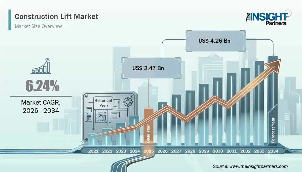
The global Construction Lift Market is witnessing steady growth due to rapid urbanization, increasing infrastructure development projects, and rising investments in commercial and residential construction activities worldwide. Construction lifts are essential equipment used for transporting workers, materials, and heavy loads across multiple levels at construction sites. These systems help...
Polaris Market Research has introduced the latest market research report titled Cell Counting Market Size, Share, Trends, Industry Analysis Report: By Product (Instruments and Consumables & Accessories), Application, End Use, and Region (North America, Europe, Asia Pacific, Latin America, and Middle East & Africa) – Market Forecast, 2025–2034 that highlights the...
Drug Discovery Outsourcing Market: Comprehensive Overview, Trends, and Forecast The Drug Discovery Outsourcing Market is one of the fastest-growing segments in the global pharmaceutical and biotechnology services industry. As research and development (R&D) costs continue to rise and timelines become more compressed, pharmaceutical companies, biotech firms, and even academic...