

How to Create Professional Charts Using a Line Graph Maker: A Complete Guide
How to Create Professional Charts Using a Line Graph Maker: A Complete Guide
Data is everywhere, from business reports and academic research to website analytics and financial forecasting. However, raw numbers alone can be difficult to understand and interpret. This is where a line graph maker becomes an essential tool. By converting numerical information into a visual format, line graphs make it easier to identify trends, compare performance, and communicate insights effectively. Whether you are a student, teacher, marketer, researcher, or business owner, understanding how to create professional charts can significantly improve the way you present and analyze data.
What Is a Line Graph?
A line graph is a chart that uses points connected by lines to display changes over time or across a sequence of categories. It is one of the most popular methods for visualizing trends because it provides a clear picture of how values increase, decrease, or fluctuate.
For example, a company may use a line graph to show monthly sales growth, while a student may use one to display scientific experiment results. Because line graphs focus on change and progression, they are ideal for tracking performance and identifying patterns.
Why Use a Line Graph Instead of a Table?
While tables are useful for storing data, they often make it difficult to recognize trends at a glance. A line graph transforms rows of numbers into a visual story.
Benefits of using line graphs include:
-
Easier trend analysis
-
Faster data interpretation
-
Better presentations
-
Improved decision-making
-
Enhanced audience engagement
-
Clear comparison of multiple datasets
Instead of reviewing dozens of figures manually, viewers can instantly understand what the data is showing.
What Is a Line Graph Maker?
A line graph maker is an online or software-based tool designed to create line graphs automatically from user-entered data. These tools eliminate the need for manual graph drawing and help users generate professional-quality charts within minutes.
Most graph makers allow users to:
-
Enter numerical data
-
Label axes
-
Customize colors
-
Add titles and legends
-
Compare multiple datasets
-
Download charts for reports and presentations
Modern graphing tools are designed to be user-friendly, making them suitable for beginners and professionals alike.
Who Can Benefit from a Line Graph Maker?
Students
Students frequently use graphs for mathematics, science, economics, and statistics projects. A graph maker helps simplify complex assignments and improves presentation quality.
Teachers
Teachers can create educational materials, classroom presentations, and performance reports using line graphs.
Business Owners
Businesses rely on graphs to monitor growth, evaluate performance, and communicate results to stakeholders.
Researchers
Researchers use line graphs to present findings, compare variables, and analyze trends in collected data.
Marketers
Marketing professionals often visualize website traffic, advertising performance, and customer engagement using line graphs.
Understanding the Components of a Line Graph
Before creating a chart, it is important to understand its key components.
Graph Title
The title explains what the graph represents and helps viewers understand the purpose of the data.
X-Axis
The horizontal axis generally displays categories or time periods.
Examples include:
-
Days
-
Weeks
-
Months
-
Years
-
Product categories
Y-Axis
The vertical axis shows numerical values or measurements.
Examples include:
-
Revenue
-
Sales
-
Population
-
Temperature
-
Test scores
Data Points
Each point on the graph represents a specific value within the dataset.
Connecting Lines
The lines connecting data points reveal trends and relationships.
Legend
Legends help identify different data series when multiple lines appear on the same graph.
Steps to Create a Professional Line Graph
Step 1: Gather Your Data
Before creating a graph, organize your information clearly.
Example:
| Month | Sales |
|---|---|
| January | 500 |
| February | 650 |
| March | 800 |
| April | 900 |
| May | 950 |
Accurate and organized data forms the foundation of an effective graph.
Step 2: Choose a Reliable Graph Maker
Select a graphing tool that offers:
-
Easy data entry
-
Customization options
-
Export features
-
Responsive design
-
High-quality chart output
A good graph maker simplifies the entire process.
Step 3: Enter Data
Input your values into the graph maker's data table. Most tools automatically recognize rows and columns.
Step 4: Label the Axes
Proper labels ensure viewers understand what the graph represents.
For example:
-
X-axis: Months
-
Y-axis: Sales Revenue
Clear labeling improves readability and interpretation.
Step 5: Customize the Design
Professional graphs often include:
-
Meaningful titles
-
Appropriate colors
-
Readable fonts
-
Consistent formatting
-
Gridlines for reference
Avoid excessive decorations that may distract from the data.
Step 6: Review and Export
Check for errors before downloading the final graph. Once satisfied, export the chart in your preferred format.
Creating a Line Graph with X and Y Axis
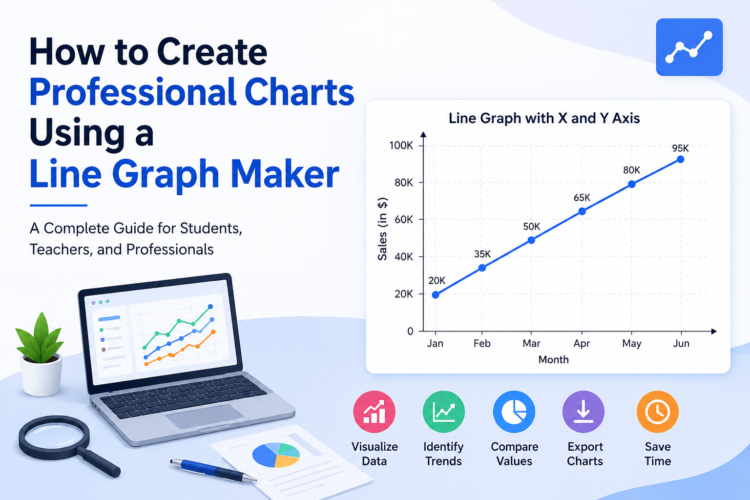
One of the most important aspects of chart creation is understanding the role of each axis. A Line Graph with x and y axis provides a structured framework for displaying information clearly.
For example, consider the following data:
| Year | Revenue |
|---|---|
| 2021 | 50,000 |
| 2022 | 65,000 |
| 2023 | 82,000 |
| 2024 | 95,000 |
In this graph:
-
The x-axis represents years.
-
The y-axis represents revenue values.
Once plotted, the graph immediately shows growth trends and helps users evaluate business performance over time.
Common Uses of Line Graphs
Business Reporting
Organizations use line graphs to track:
-
Revenue growth
-
Customer acquisition
-
Product performance
-
Operational efficiency
Education
Students and educators use graphs to:
-
Compare results
-
Present research findings
-
Analyze experiments
-
Visualize statistical data
Healthcare
Healthcare professionals may use line graphs to monitor:
-
Patient recovery
-
Disease outbreaks
-
Treatment effectiveness
Finance
Financial experts often track:
-
Stock prices
-
Investment returns
-
Market performance
-
Economic indicators
Website Analytics
Website owners use line graphs to analyze:
-
Traffic growth
-
User engagement
-
Conversion rates
-
Advertising performance
Features of a Good Line Graph Maker
Not all graphing tools offer the same functionality. Consider the following features when selecting one.
User-Friendly Interface
The tool should be easy to navigate, even for beginners.
Multiple Data Series Support
Advanced tools allow comparison of multiple datasets on a single graph.
Customization Options
Look for options such as:
-
Colors
-
Themes
-
Font styles
-
Data labels
-
Gridlines
Export Capabilities
The ability to export graphs in PNG, JPG, PDF, or SVG formats is valuable for professional use.
Mobile Compatibility
Cloud-based graph makers allow users to create and edit charts from various devices.
Common Mistakes to Avoid
Overcrowding the Graph
Too many data points or lines can reduce readability.
Using Poor Labels
Unclear labels confuse viewers and reduce effectiveness.
Inconsistent Scales
Improper scaling can distort trends and create misleading impressions.
Choosing the Wrong Chart Type
Line graphs work best for trends and changes over time. Other chart types may be more appropriate for different data.
Ignoring Data Accuracy
Even the most attractive graph loses value if the underlying data is incorrect.
Tips for Creating Professional Charts
To make your charts more effective:
-
Keep designs clean and simple
-
Use descriptive titles
-
Label axes clearly
-
Maintain consistent scales
-
Highlight important trends
-
Avoid unnecessary visual effects
-
Use contrasting colors when comparing datasets
These best practices improve both readability and professionalism.
The Future of Line Graph Makers
Technology continues to improve data visualization tools. Modern graph makers increasingly include:
-
AI-assisted chart creation
-
Real-time collaboration
-
Interactive dashboards
-
Cloud storage integration
-
Advanced analytics features
These innovations help users create more powerful and informative visualizations with less effort.
Read More:
https://logcla.com/blogs/1784739/How-a-Line-Graph-Maker-Helps-You-Visualize-Data-and
Conclusion
A line graph is one of the most effective ways to present trends, patterns, and performance data. By using a line graph maker, users can quickly transform raw numbers into professional visualizations that support analysis, communication, and decision-making.
Whether you are a student preparing a project, a business owner reviewing growth, or a researcher presenting findings, understanding how to create professional charts can significantly improve the impact of your data. With proper planning, accurate information, and thoughtful design, line graphs can turn complex datasets into clear and meaningful insights.
Frequently Asked Questions (FAQs)
What is a line graph maker?
A line graph maker is a tool that converts numerical data into a visual line graph by plotting points and connecting them with lines.
Why are line graphs important?
Line graphs make it easier to identify trends, compare values, and understand changes over time.
What is the purpose of the x-axis?
The x-axis usually represents time periods, categories, or sequences within the dataset.
What does the y-axis represent?
The y-axis displays numerical values or measurements associated with the data.
Can I create multiple lines on one graph?
Yes. Many graph makers allow users to compare multiple datasets using separate lines on the same chart.
Are line graphs suitable for business reports?
Yes. Businesses commonly use line graphs to analyze sales, revenue, customer growth, and performance metrics.
What file formats can I export my graph in?
Most graph makers support PNG, JPG, PDF, and SVG formats.
Is a line graph better than a table?
For identifying patterns and trends quickly, a line graph is generally more effective than a table of numbers.
Can beginners use a line graph maker?
Yes. Most modern tools are designed for users with little or no technical experience.
What are the most common mistakes when creating a line graph?
Common mistakes include overcrowding the graph, using poor labels, inconsistent scales, and presenting inaccurate data.
الأقسام
إقرأ المزيد
Kashmir has long been known as "Paradise on Earth" because of its stunning landscapes, crystal-clear lakes, majestic mountains, and charming valleys. Travelers looking for a complete vacation experience often choose the Best Kashmir Tour Packages to explore the region conveniently and affordably. Why Tour Packages Are Popular Tour packages eliminate the hassle of planning every detail...

โรคหลอดเลือดสมองเป็นหนึ่งในภาวะทางสุขภาพที่ส่งผลกระทบต่อผู้ป่วยและครอบครัวอย่างมาก ไม่เพียงแต่ส่งผลต่อการเคลื่อนไหวของร่างกาย แต่ยังอาจกระทบต่อการพูด การกลืน ความจำ และการใช้ชีวิตประจำวัน หลังจากผ่านการรักษาในโรงพยาบาลแล้ว การฟื้นฟูร่างกายและสมองถือเป็นขั้นตอนสำคัญที่จะช่วยเพิ่มโอกาสในการกลับมาใช้ชีวิตได้ใกล้เคียงปกติมากที่สุด การเลือก ศูนย์ฟื้นฟูผู้ป่วยโรคหลอดเลือดสมอง...

Even with a healthy lifestyle, some areas of fat remain stubborn and resist diet and exercise. These problem areas can affect your overall body shape and confidence. For those seeking a safe and effective solution, Liposuction in Islamabad offers a precise cosmetic procedure to remove fat and sculpt your body naturally. Understanding Liposuction Liposuction is a surgical procedure designed to...

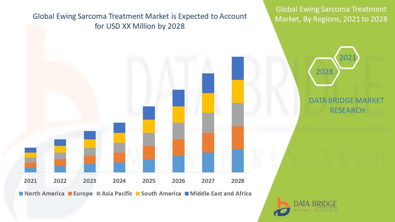
Key Drivers Impacting Executive Summary Ewing Sarcoma Treatment Market Size and Share CAGR Value Ewing sarcoma treatment market is expected to gain market growth in the forecast period of 2021 to 2028. Data Bridge Market Research analyses the market is growing at a CAGR of 6.30% in the above-mentioned research forecast period. Business intelligence has been employed here to...
If you are planning to manufacture, import, distribute, or sell products in Dubai, Product Registration Dubai is a critical legal requirement that cannot be overlooked. The UAE has a robust and well-regulated product compliance framework governed by multiple authorities, and every product entering or being sold in the UAE market must meet the relevant regulatory standards before it can be...