
How a Color Contrast Checker Improves Website Accessibility

Introduction
Website accessibility has become a crucial part of modern digital design. As the internet continues to grow, it must serve users of all abilities, including those with visual impairments and color vision deficiencies. One key factor that determines whether a website is accessible is the contrast between text and background colors. This is where a Color Contrast Checker plays a vital role. It helps designers and developers ensure that their content is readable, inclusive, and compliant with accessibility standards.
Understanding Color Contrast in Web Design
Color contrast refers to the difference in brightness between two colors, typically the text and its background. If the contrast is too low, users may struggle to read the content. A Color Contrast Checker evaluates this difference and provides a ratio based on guidelines like WCAG (Web Content Accessibility Guidelines). These standards define the minimum contrast levels required to make content readable for most users.
Enhancing Readability for All Users
One of the biggest advantages of using a Color Contrast Checker is improved readability. When text stands out clearly from the background, users can easily consume the information. This is especially important for people with low vision or those browsing in difficult lighting conditions. By ensuring proper contrast, websites become more user-friendly and engaging.
Supporting Users with Visual Impairments
Millions of people around the world experience visual impairments, including color blindness. Without proper contrast, important elements such as buttons, links, and headings may become difficult to distinguish. A Color Contrast Checker helps identify problematic color combinations and suggests improvements, making websites more inclusive for everyone.
Meeting Accessibility Standards
Accessibility guidelines like WCAG require websites to maintain specific contrast ratios. Failing to meet these standards can result in a poor user experience and even legal consequences in some regions. A Color Contrast Checker ensures that your design meets these requirements, helping you stay compliant and avoid potential issues.
Improving User Experience and Engagement
User experience is directly linked to how easily visitors can interact with your website. Poor contrast can lead to frustration and increased bounce rates. By using a Color Contrast Checker, designers can create visually clear interfaces that keep users engaged and encourage them to stay longer on the site.
Boosting SEO Performance
While color contrast itself is not a direct ranking factor, it influences user behavior, which impacts SEO. When users can read and navigate content easily, they are more likely to spend time on the site and interact with it. A Color Contrast Checker indirectly contributes to better SEO by improving usability and reducing bounce rates.
Maintaining Brand Consistency
Brands often have specific color schemes that define their identity. However, not all brand colors meet accessibility standards. A Color Contrast Checker helps designers adjust shades or choose alternative combinations that maintain brand identity while ensuring readability. This balance is essential for professional and accessible design.
Saving Time in the Design Process
Fixing accessibility issues after a website is built can be time-consuming and costly. Using a Color Contrast Checker during the design phase allows teams to address problems early. This proactive approach improves efficiency and ensures accessibility is integrated from the beginning.
Ensuring Mobile Accessibility
With the increasing use of mobile devices, websites must be optimized for smaller screens. Low contrast becomes even more problematic on mobile displays. A Color Contrast Checker helps ensure that text remains clear and readable across all devices, providing a consistent user experience.
Encouraging Better Design Practices
Using accessibility tools encourages designers to think more carefully about their choices. A Color Contrast Checker provides instant feedback, helping designers learn and apply best practices. Over time, this leads to higher-quality designs and more accessible digital experiences.
Conclusion
Creating an accessible website is essential in today’s digital world. A Color Contrast Checker is a simple yet powerful tool that helps improve readability, support users with visual impairments, and ensure compliance with accessibility standards. By integrating it into the design process, businesses can create inclusive, user-friendly websites that benefit everyone.
Categorie
Leggi tutto
Many small business owners are experts at their craft but struggle to grow sustainably. Without effective systems and processes, operations become inefficient, mistakes multiply, and scaling becomes nearly impossible. Implementing structured systems and processes for small business growth is essential to increase productivity, improve client satisfaction, and drive profitability. Understanding...

Looking for a real estate agent near me? We understand that choosing the right professional can make all the difference. First, we listen to your goals and explain every step in plain language. Then, we help you navigate listings, negotiations, inspections, and paperwork with confidence. Along the way, we provide honest advice and responsive communication, so you're never left wondering...
According to the latest report published by Data Bridge Market Research, the Asia-Pacific Knee Cartilage Repair Market The Asia-Pacific knee cartilage repair market size was valued at USD 779.69 million in 2024 and is expected to reach USD 1,809.83 million by 2032, at a CAGR of 11.1% during the forecast period The market growth is primarily driven by...

Clean and safe drinking water has become a necessity for every household and business in Delhi. With increasing pollution, hard water issues, and contamination in water supplies, RO water purifiers are now an essential appliance in homes, offices, schools, hospitals, and commercial spaces. However, simply installing an RO system is not enough. Regular maintenance and timely servicing are...

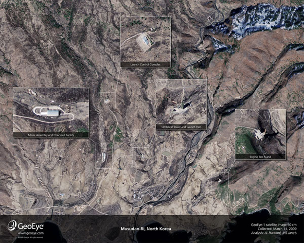
Amid escalating tensions in East Asia, recent satellite images have provided an unprecedented close-up view of North Korea's missile infrastructure. Captured at 11:49 a.m. local time on Sunday, March 29, the images were taken from an altitude of approximately 423 miles, offering a slightly oblique perspective. These high-resolution photographs reveal critical features at the Musudan-ri missile...